Lancy Freelancing Filters & Feed.
View Prototype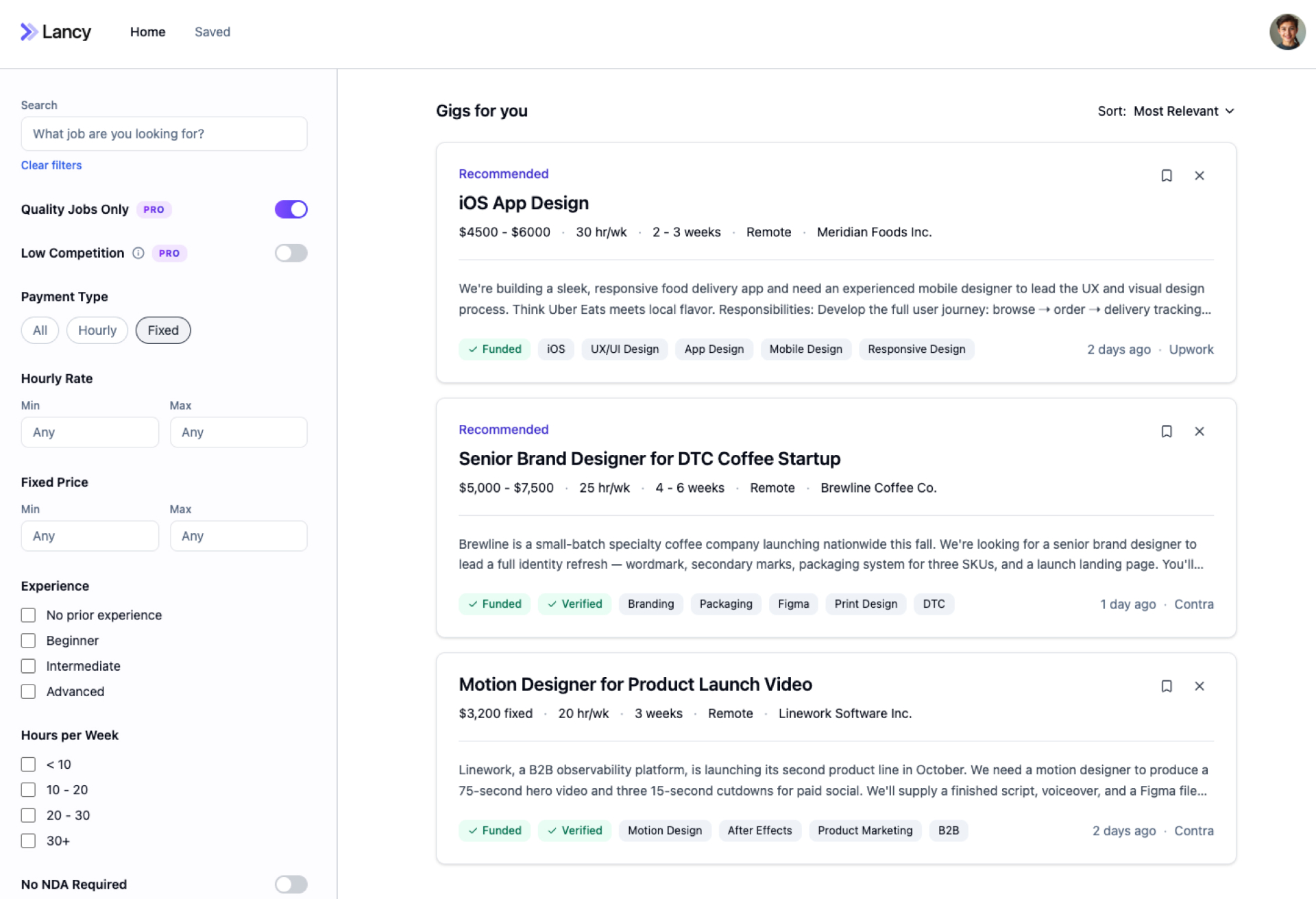
Objective
This project was to design Lancy, a freelance job aggregator. The platform pulls gigs from the major freelance boards into one central feed and filters out low-quality work. With advanced filtering, users can quickly narrow the feed to exactly the gigs they want.
- Role
- UX Designer
- Team
- 1 developer, 1 product manager
- Timeline
- 6 weeks
- Tools
- Figma, Userbrain, Claude Cowork, Lovable
Competitor Analysis
Before I jumped into design, I started with competitor research and a feature analysis to understand industry standards and inform what features would be required for our MVP.
View full analysis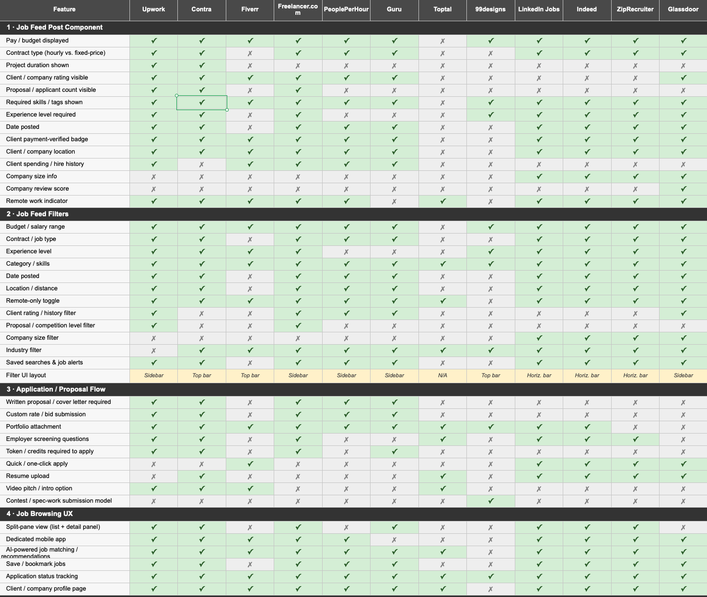
User Research
Testing our core assumption
User interviews for this project were critical: they invalidated our core assumption and reframed our key value proposition from aggregation to filtering.
Filter Layout & Structure
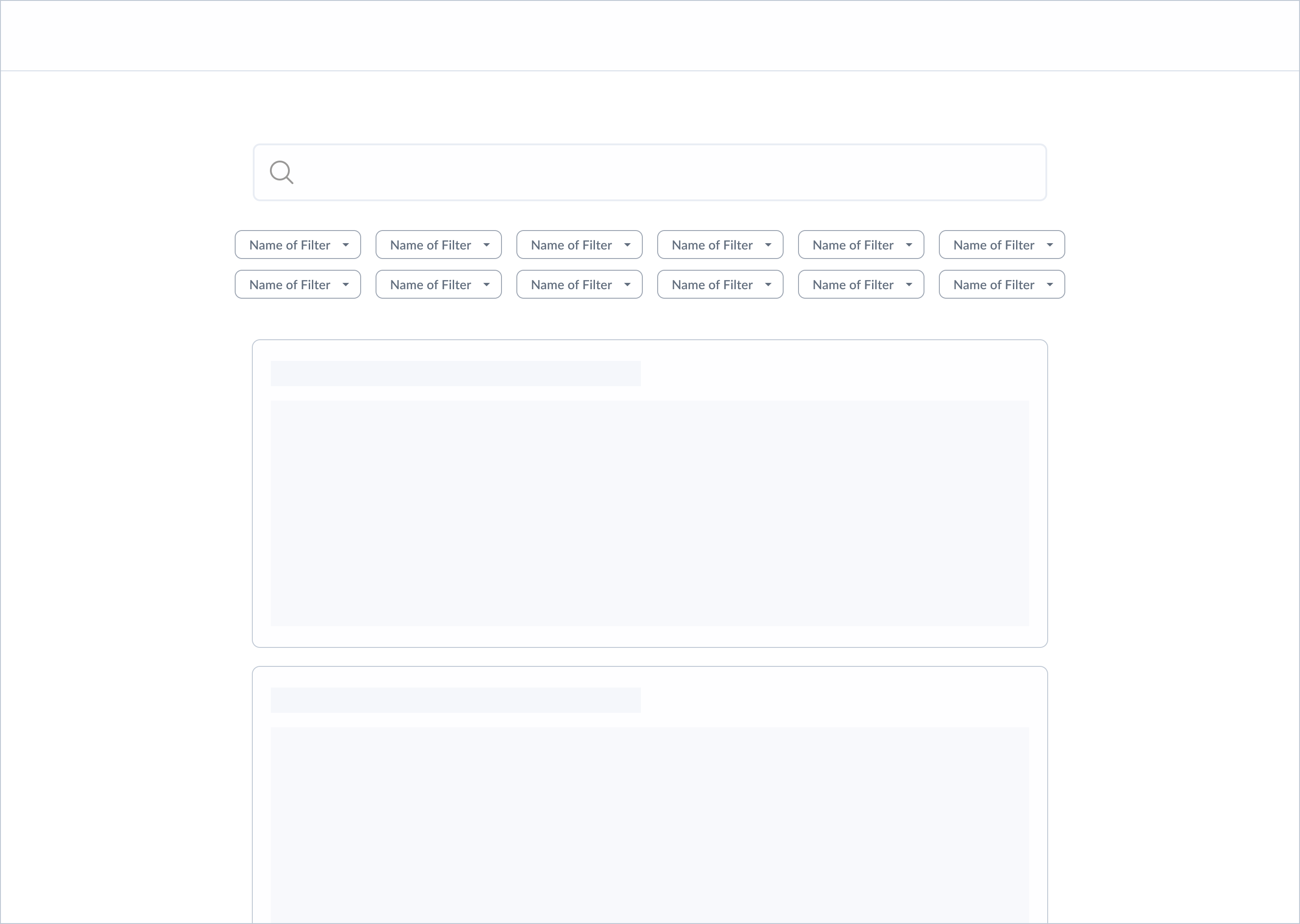
The first core task I focused on was how filtering would function — an essential part of the Lancy experience, given its core value proposition of helping users quickly surface relevant gigs. After analyzing filtering patterns across other job board platforms and wireframing multiple layouts, I narrowed testing down to four variants: a single scrollable row of filters, two stacked rows, a grouped filtering sidebar, and an ungrouped sidebar.
Horizontal Filters
Opt 1 · Single, scrollable row of filters.

Opt 2 · Two rows of filters.
Filter Sidebar
Opt 3 · Grouped filtering sidebar.
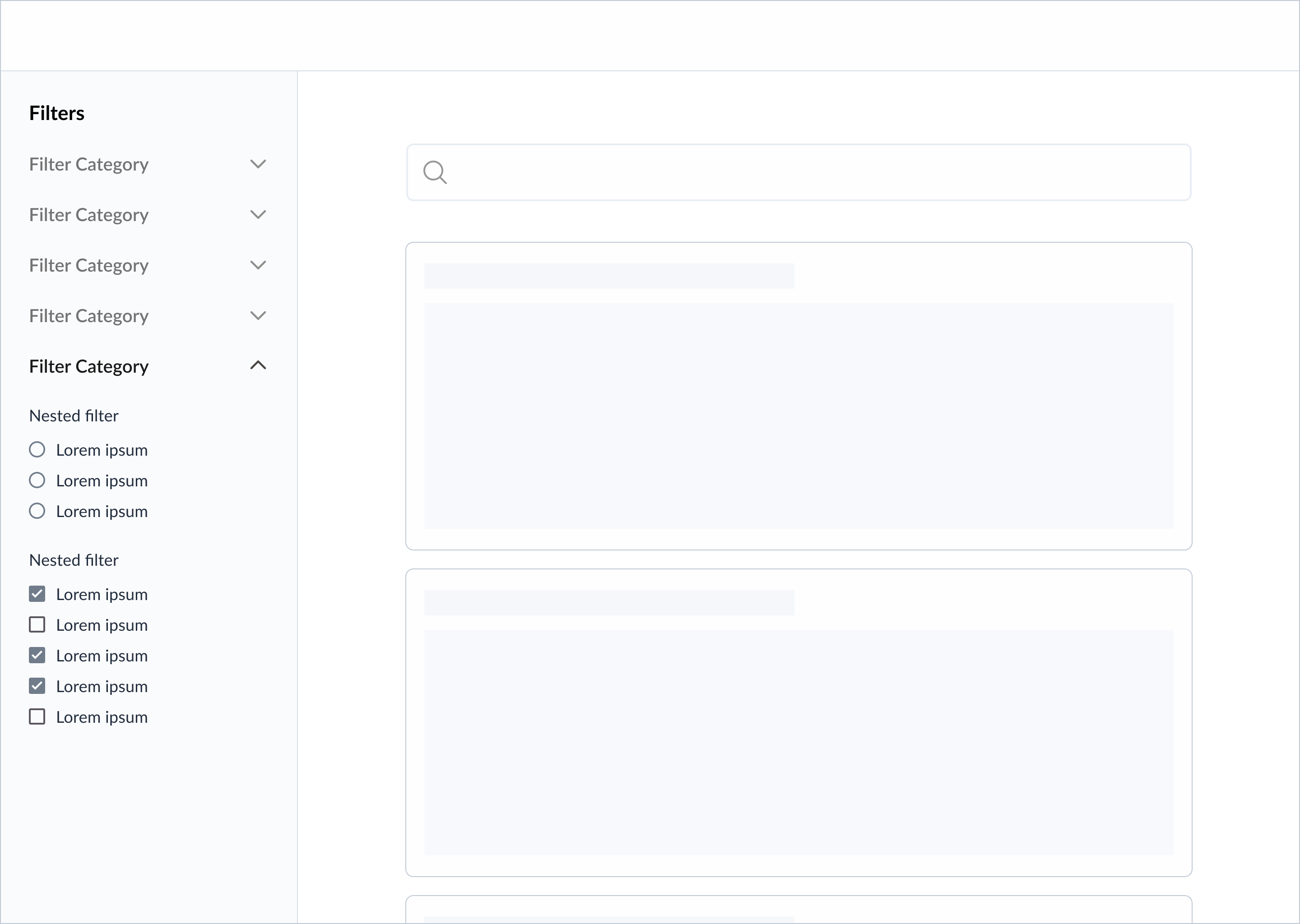
Opt 4 · Ungrouped filtering sidebar.

Follow-Up: Assessing for Cognitive Overload
Even though the ungrouped sidebar performed best, I wanted to be sure before locking it in. Was showing all filters at once too much information? Even at a faster filtering pace, could it slow down other tasks on the platform?
I ran a quick follow-up test to check for signs of cognitive overload.
The Quality Jobs Only filter
The "High-Quality Jobs" filter is tied to Lancy's pro subscription, so its placement and discoverability were critical. Because of its importance, I tested this feature separately from the broader filter structure — comparing a toggle inside the filter sidebar against a toggle pinned above the job feed.

Opt 1 · Placement at top of sidebar.
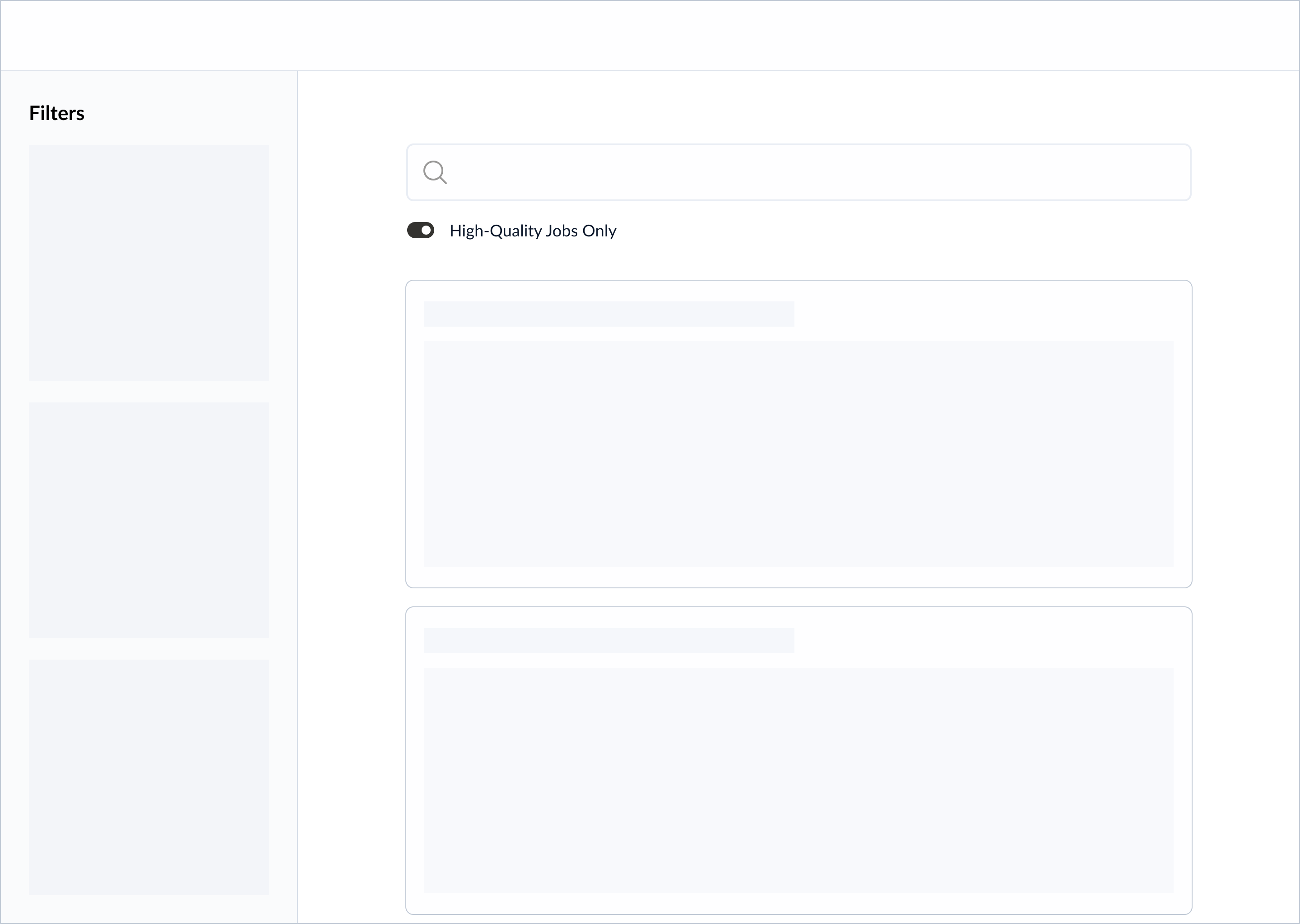
Opt 2 · Placement above the job feed.
Design Iterations
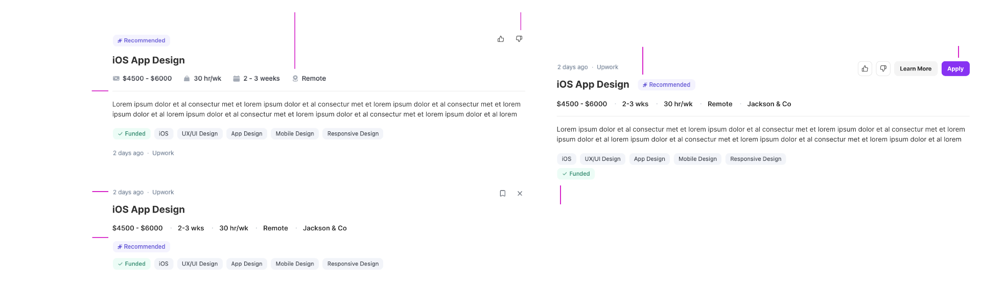
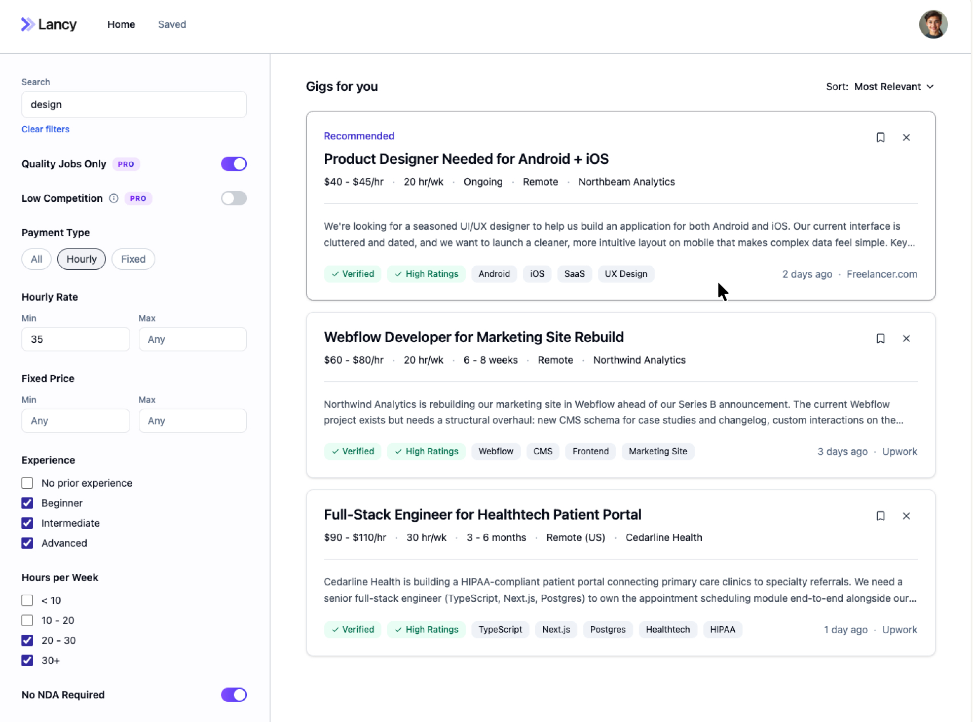
With the filter structure settled, I turned to the unit that powers the feed itself: the job post card. I explored two layouts — one that leads with the project title and tags before the meta row, and one that keeps the timestamp and source at the top with quick actions inline. Both versions surface the same information, but the hierarchy shifts what freelancers see first when scanning.
Final Designs
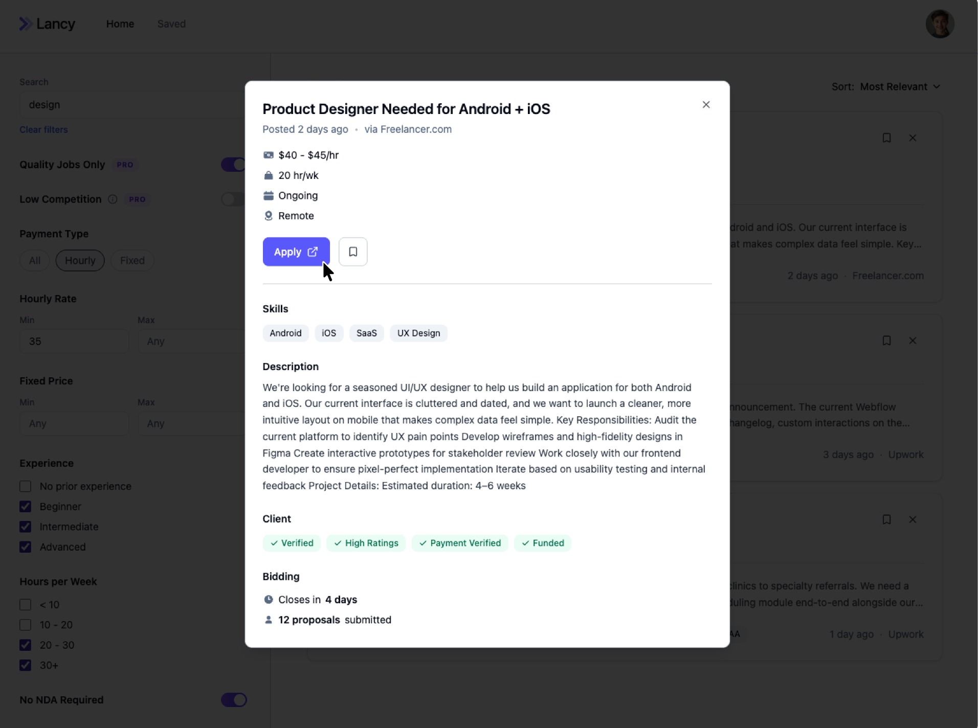
User flow · Search functionality
01User sets filters to narrow the feed
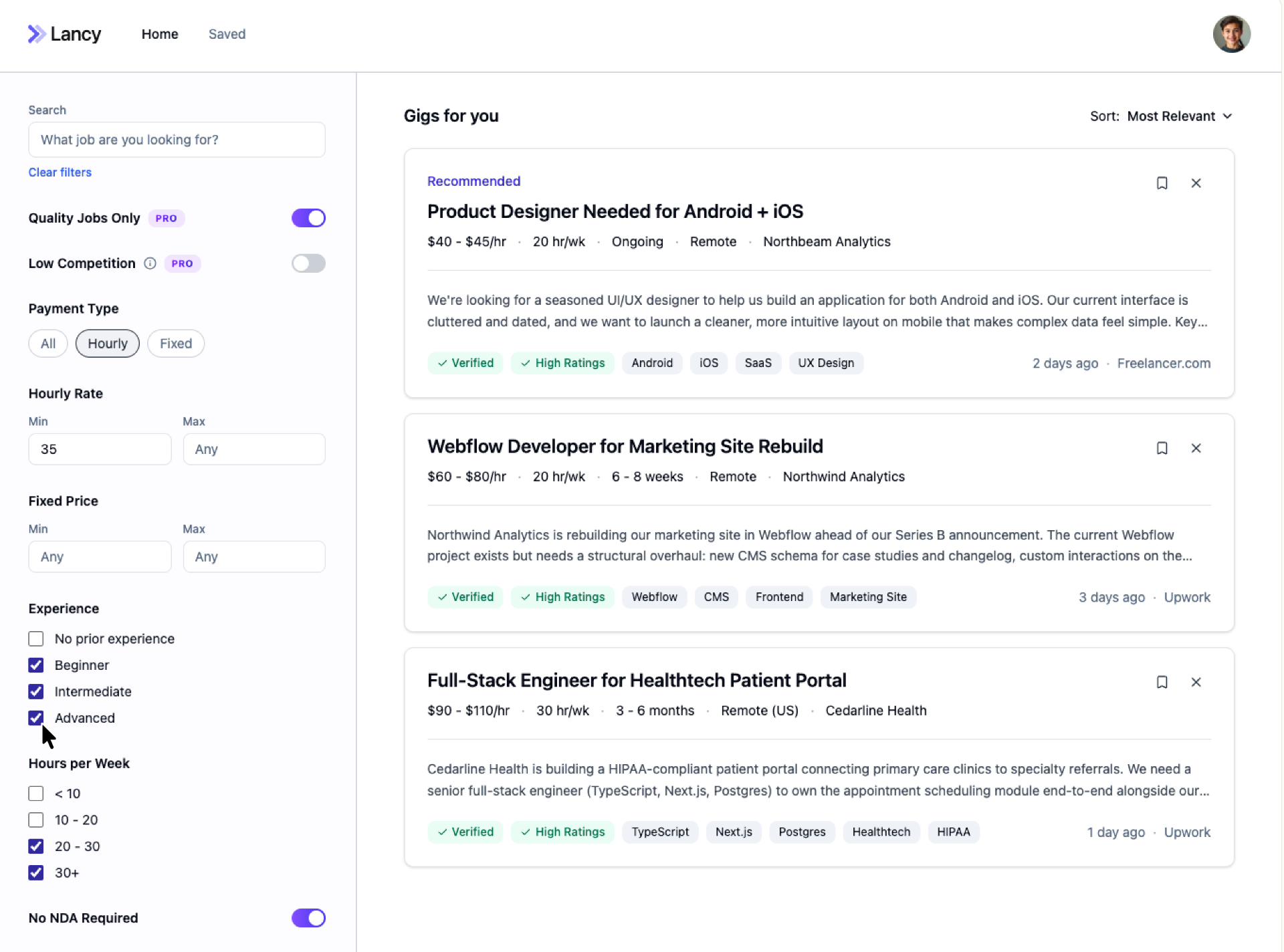
02User enters a search query
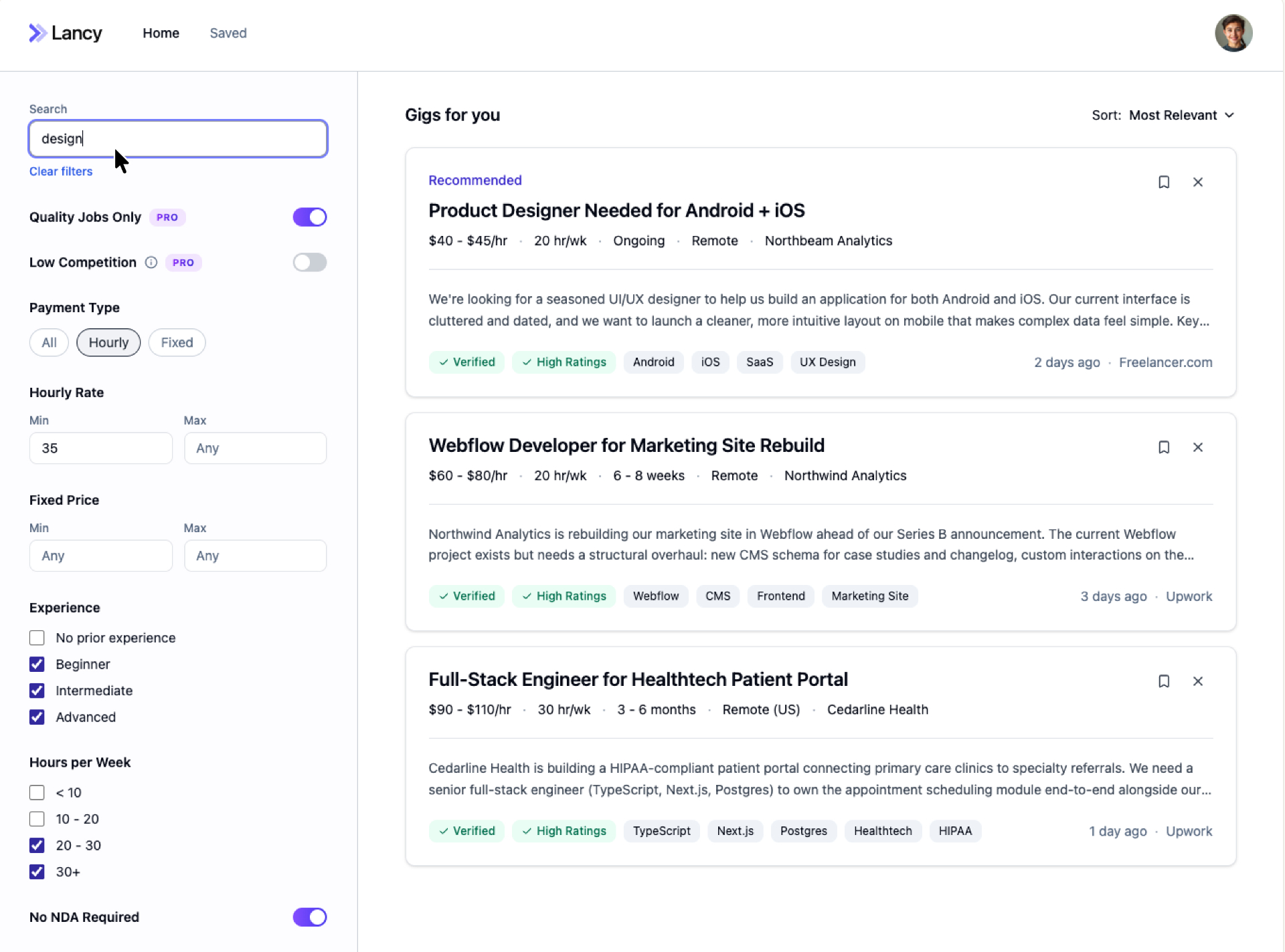
03User selects a job from the filtered results
04User reviews the job details and applies
Additional Screens
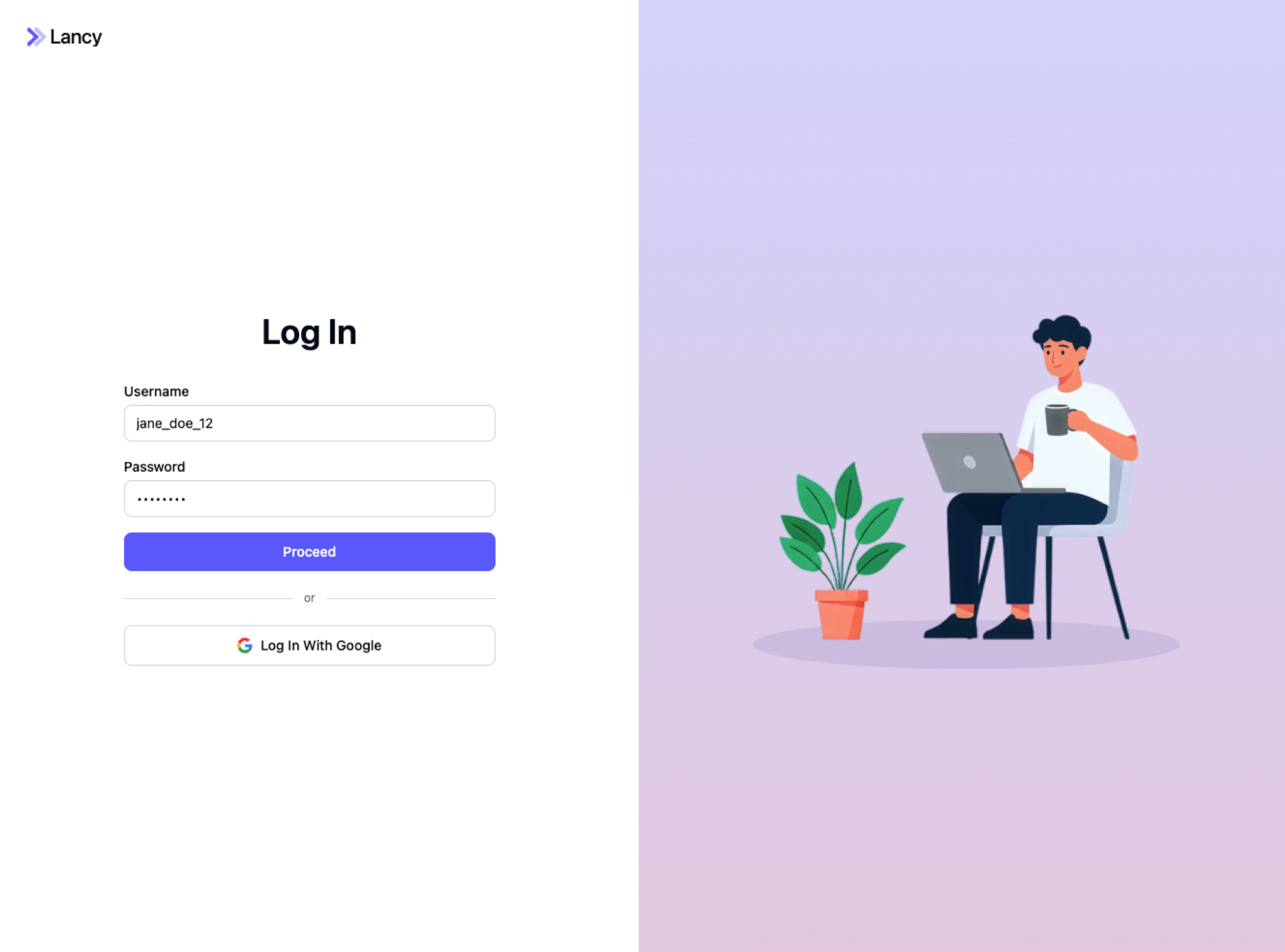
Log in · 1 / 3
Reflection
Talking directly to our target audience was invaluable. Early user interviews surfaced pain points we wouldn't have caught otherwise. We started out assuming users wanted more job posts — but conversations revealed it wasn't about quantity. Freelancers weren't overwhelmed by too few options; they were overwhelmed by too many irrelevant ones. That insight reshaped the product, shifting the focus from volume to intelligent filtering.
Lesson learned
Talk to users before you trust your assumptions. Without those early conversations, we would have invested in solving the wrong problem.
Next
Browse all projects