Blueprint Prep AI Chatbot.
Objective
This project focuses on a single feature of the MCAT Native App design. The assignment was to give users access to Blueprint's AI chatbot, "Blue," within the exam interface's "Review Mode" on mobile. The core challenge of the project was that, unlike other commonly used chatbots like ChatGPT, this chatbot was meant to be used on mobile while the user was actively engaging with another interface. The chatbot was a supplemental feature, rather than the core focus.
- Role
- UX Designer
- Team
- 1 PM, 1 TPM, 2 mobile developers
- Timeline
- 8 weeks
- Tools
- Figma, Userbrain, Claude Cowork, Lovable
Results
The supplemental chatbot saw strong engagement during Review Mode sessions.
- 0%
- Activation rate during Review Mode
- +0pp
- Over desktop chatbot engagement
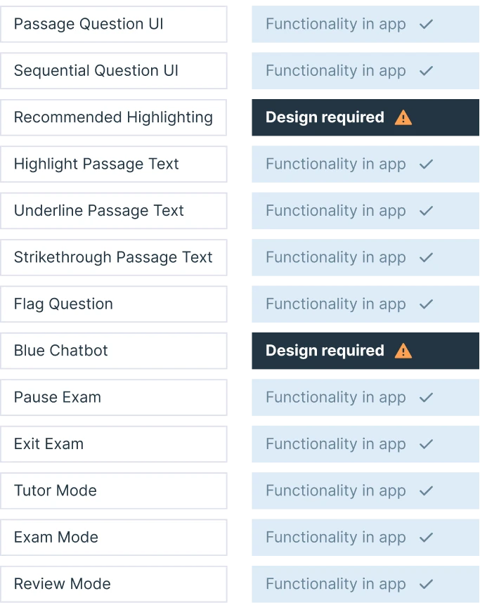
Platform Audit
The first step of this project was to audit the web application for Blueprint's MCAT prep platform to identify what new features we'd need to build to launch the iOS native app for that vertical. (We of course were using the qbank app design for our other verticals as a foundation for MCAT.)
After analyzing, the features I recommended to project management that we build specifically for the MCAT launch were: (1) recommended highlighting, (2) AI practice set recommendations, (3) the periodic table, and (4) "Blue," the AI chatbot for Review Mode.
(On the other hand, some features that MCAT had on the web application I suggested we leave off to conserve resources, such as question "Recycle Mode.")
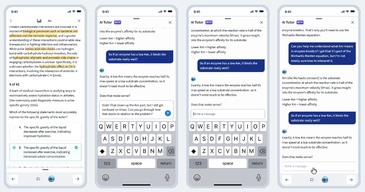
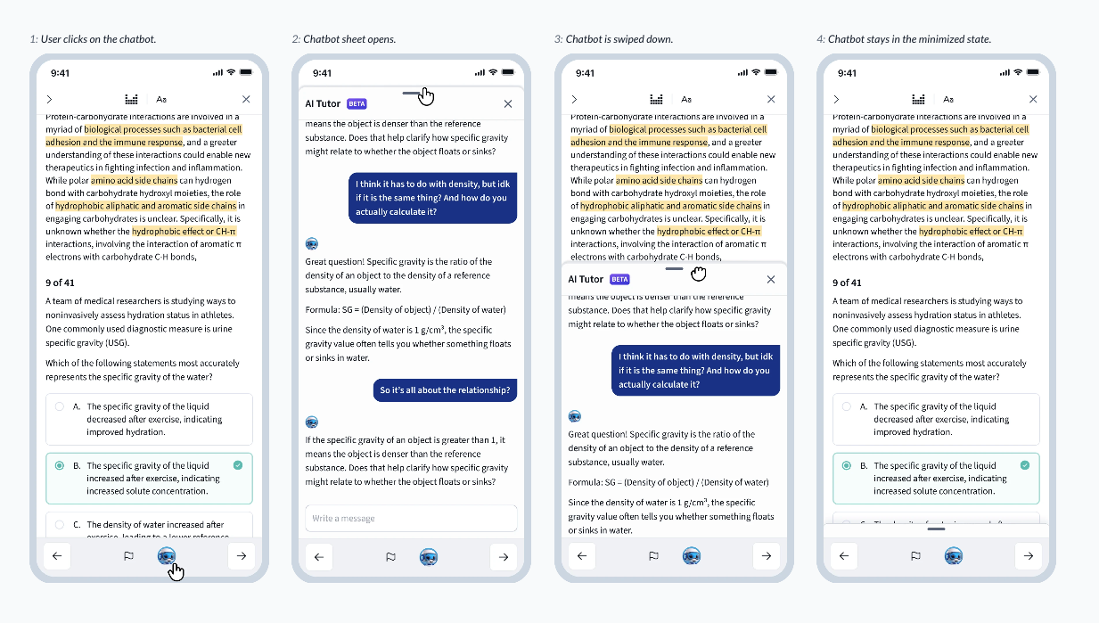
Placement
The first question I tackled was placement: within the existing "Review Mode" interface, where should the chatbot live? After considering quite a few options, I decided on a placement in the bottom navigation: its placement required no significant adjustments to the interface structure, didn't cover any exam content, and kept the chatbot trigger, text input, and keyboard in the same general location, close to the user's thumbs.

Design Strategy: A Minimizable Sheet
Stakeholders had one immediate ask: they wanted to view both the exam question at hand and the chatbot conversation simultaneously, on the same screen. I had several reservations about this request: the division of limited mobile real estate, multiple scrollable windows on the same screen, and how keyboard functionality would fit in, to name a few.
To allow the user to quickly engage with both the chatbot and the question without dividing the screen, I pitched an alternative: a minimizable sheet, allowing the chatbot to be opened and closed with just a swipe. This would allow for a quick toggle back and forth– not simultaneous viewing, but close.
Stakeholders were on board, and we moved forward with this structure.
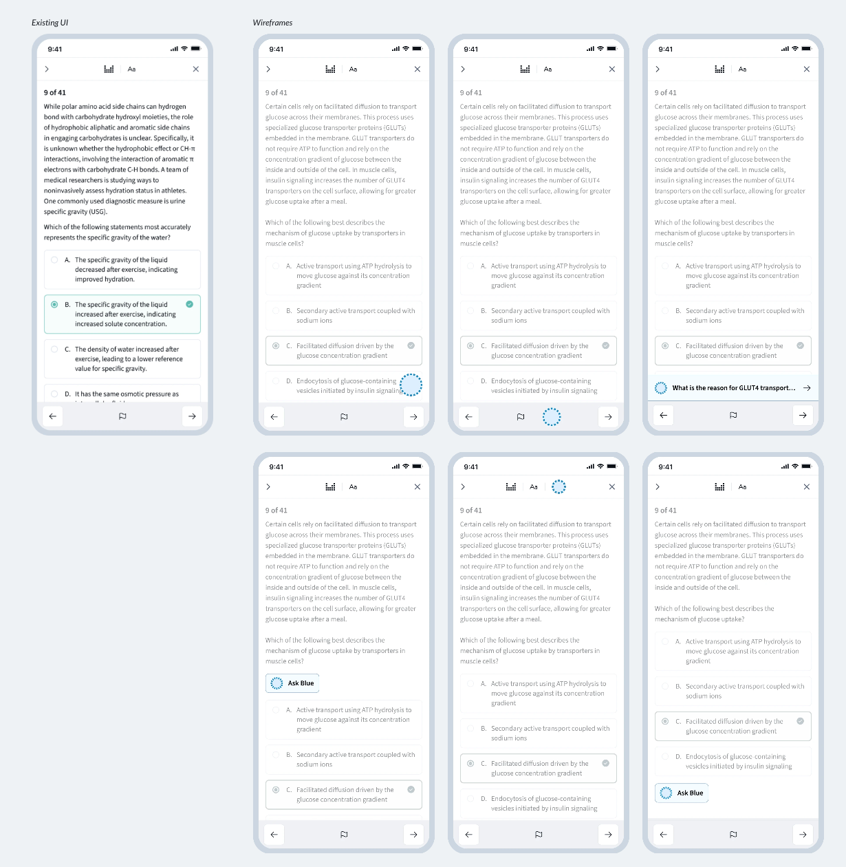
Final Designs
Two core user flows came out of the final design — opening and closing the chat, and the keyboard interaction & input design.
User flow · Opening and closing the chat
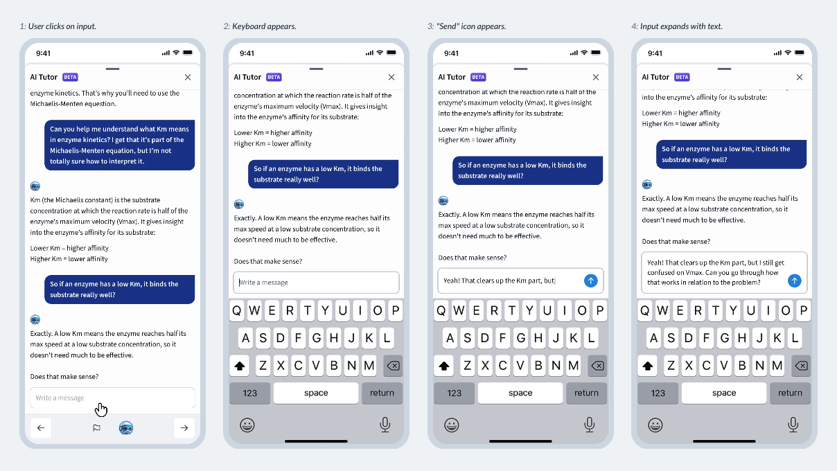
User flow · Keyboard interaction & input design
Additional States
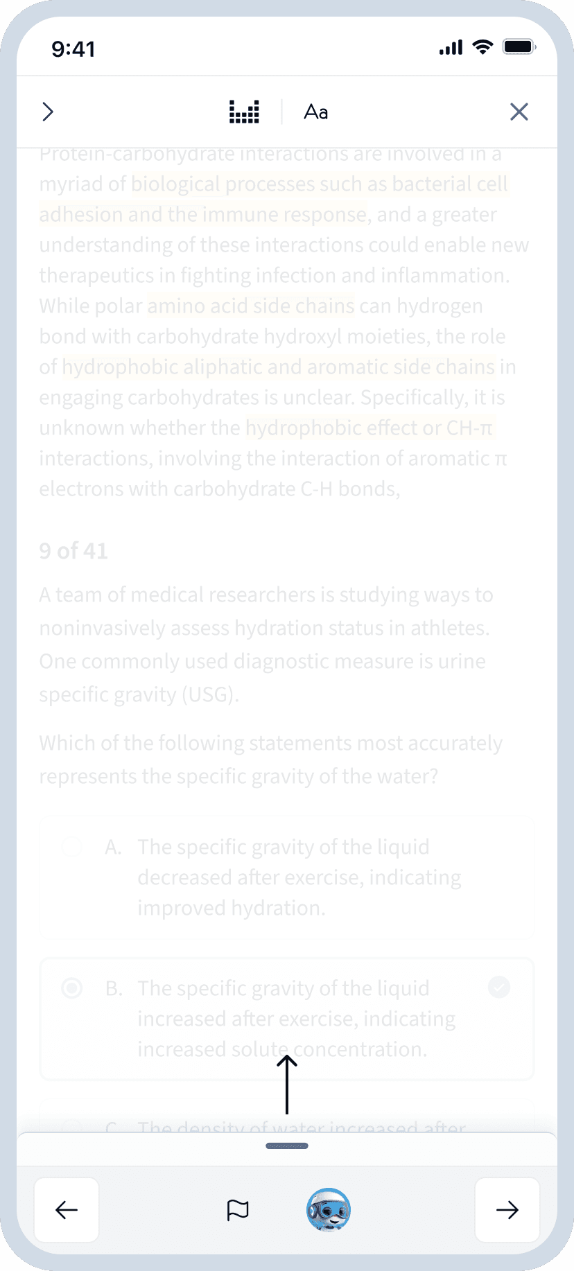
When scrolling through the chat, a fade out effect at the bottom of the chat would indicate continued conversation below. (This was not implemented at the top, due to the border.)
The input expands as the user types, becoming scrollable after five lines of input text.
Reflection
One challenge with this project was that some stakeholders had a specific UI solution in mind from the beginning of the process. This made managing expectations difficult at times, since I thought the specific solution desired by stakeholders would create a negative experience for the user. While a solution was still achieved within the required time frame, this did increase the work required for the project.
Lesson learned
Moving forward, if a specific UI solution is requested from the start of a project, I'll aim to surface concerns early in the process, confirming an inability to commit to a solution before the problem has been fully explored, and by using prototypes to both demonstrate what works and highlight potential UX trade-off's.
Next
Browse all projects